
15 Blue Christmas Decor Ideas

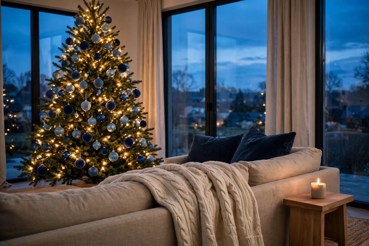
Blue is the Christmas color that makes guests exhale. It reads calm, wintry, and quietly elegant — but it is also the easiest palette to get wrong. Pick the wrong blue, pair it with the wrong metal, light it with the wrong bulbs, and a room that should feel like a snowy evening turns cold, flat, or strangely nautical. These 15 blue Christmas decor ideas fix that by starting with the palette itself: which blue leads, which metallic warms it, and which texture grounds it, then carrying that same system across the whole home, from the tree to the gift wrap under it.
The ideas below are organized as one house-wide plan rather than a pile of blue objects. A few are splurges worth saving for (a velvet moment, chinoiserie pieces), and several cost almost nothing — wrapping paper, pillows you may already own, blue glassware from the kitchen cabinet. If your home usually leans warm and minimal, our simple Christmas decor ideas make a good companion read; this guide is the same coziness, dressed in winter blue.
Key Takeaways
- Blue works as a system: one lead blue, one metallic, and one warm grounding texture (cream, wool, or wood), repeated in every room.
- The 2026 headline look is ski-lodge blue and cream — navy, dusty, or icy blue softened with ivory and wool instead of stark white.
- Layer three blues (deep, mid, icy) for depth; a single flat blue reads as a theme party, not a palette.
- Warm-white lights are non-negotiable. Blue schemes lit cool or blue turn gray and chilly; warm light makes navy glow.
- The cheapest blue Christmas of all lives under the tree: navy wrapping paper with white ribbon carries the palette for the price of two rolls.
First, the Three Rules That Make Blue Work
Every idea in this list runs on three decisions, made once and repeated everywhere. First, commit to one lead blue per room — navy, dusty mid-blue, or icy pale blue — and let the other blues appear only as supporting layers. Second, pick one metallic: silver reads icy and frosty, gold and brass read warm and luxe, copper reads modern and soft. Silver and gold on the same tree fight each other; choose one and let it be consistent. Third, always ground the blue with warmth — cream instead of stark white, natural wood, wool, or knit textures. An all-cool room is the one mistake nearly every blue scheme regrets.
| Lead blue | Best metallic | Ground it with | The mood |
|---|---|---|---|
| Navy | Gold or brass | Cream, warm wood | Rich, traditional, evening-cozy |
| Navy | Silver | Warm-white lights, wool | Frosty but deep — the night-sky look |
| Dusty / chambray | Brushed silver or pewter | Ivory linen, pale wood | Soft, calm, ski-lodge |
| Icy pale blue | Silver and crystal | White, glass, mirror | Bright, airy, expensive-feeling |
| Light blue | Copper | Cream, natural fibers | Modern warmth without the formality of gold |
1. Lead with Ski-Lodge Blue and Cream: 2026’s Coziest Blue
The freshest blue Christmas look this year skips the ballroom and heads for the cabin. Trend roundups for 2026 — including Mums Make Lists’ Christmas decor trends — put a cozy ski-lodge palette at the top: navy, dusty blue, or icy blue layered with cream, ivory, and soft wool textures. On the tree that means blue glass ornaments against cream knit details and natural wood; in the room it means the blue is always within arm’s reach of something warm and nubby.
The reason it works where older blue schemes failed is the cream. Stark white beside navy reads nautical and a little harsh; ivory and wool soften the contrast into something that feels like a mountain lodge at dusk. If you adopt only one idea from this list, adopt this pairing as your base and let the other ideas plug into it.

Tip: Test your blue against your cream in daylight and at night. Some ivories go yellow under warm bulbs and fight the blue; a neutral, slightly gray-leaning cream holds up in both.
2. Layer Three Blues on the Tree: Navy, Chambray, and Ice
A tree hung in one flat blue looks decorated; a tree layered in three blues looks designed. The layering rule used by stylists — documented in Caywind’s blue Christmas guide — combines a deep navy, a soft mid-tone chambray, and an icy silver-blue in a single scheme. The deep blue gives the tree its body, the mid-tone bridges, and the icy pieces sit near the outer branches where the lights catch them, like frost on the tips.
Depth comes from finish as much as from color: mix matte, gloss, velvet, and glitter versions inside each blue so no two neighboring ornaments reflect light the same way. Skip the pre-boxed assorted sets that blend five random blues in one carton — the stray mid-tones are exactly what muddies the scheme. Buy by the shade, not by the box.

Tip: Hang the darkest ornaments deepest and lowest, the icy ones highest and outermost. The tree then reads as lit from within, darkest at its core and frosted at its edges.
3. Pair Navy with Gold When Silver Feels Too Frosty
Navy and silver is the classic blue pairing, but in a room with gray sofas, cool floors, or north-facing light, it can tip the whole scheme into chilly. Navy and gold is the corrective: same depth, same formality, but the gold pulls the blue toward candlelight. It is the right choice for dining rooms and living rooms where people actually sit in the evening.
Keep the gold brushed or antiqued rather than mirror-bright, and repeat it in small, deliberate places — ornament caps, candle holders, the frame of a mirror — rather than spraying it everywhere. And hold the one-metal rule: once gold is chosen, the silver tinsel and chrome pieces stay in the storage box this year.
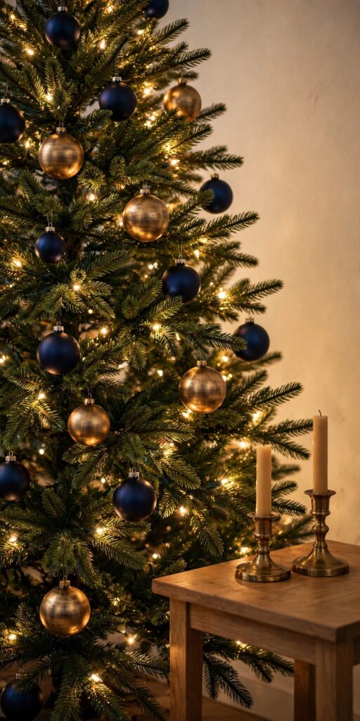
Tip: If you already own silver ornaments you love, this is the one sanctioned exception: keep them, but change the lights to the warmest white you can find and add cream textiles nearby. Warm light and texture will do the job gold would have done.
4. Try Blue and Copper for a Softer Kind of Warmth
Copper is the underrated third option between icy silver and formal gold. Against light or dusty blue it reads warm but relaxed — modern farmhouse without a single plaid cliché — and against navy it glows like embers. Copper also forgives: its brushed, slightly rosy finish looks good next to wood, leather, and the warm neutrals many homes already have.
Use it where hands and eyes linger: flatware and candle holders on the table, a copper tray under a grouping of blue glass ornaments, copper-toned ornaments scattered through the tree rather than dominating it. Because copper sits between the cool and warm camps, it is also the safest metallic if your rooms mix warm and cool finishes already.

Tip: Real copper tarnishes beautifully but unevenly; for decor that must match across a whole room, choose copper-finish pieces, which keep one consistent tone all season.
5. Bring in Blue-and-White Chinoiserie Pieces
Blue-and-white porcelain is the rare pattern that is both classic and unmistakably Christmas-ready. Chinoiserie ginger jars, patterned vases, and blue-and-white ornaments carry the palette with built-in detail, so a few pieces do the work of a dozen plain ones. It is the hero splurge of this list: one beautiful jar on the mantel or entry table anchors an entire room’s scheme.
The trick is restraint. Chinoiserie pattern is busy, so give it plain company — solid navy, solid cream, clear glass — and let the pattern appear in two or three places per room at most. A short run of chinoiserie-pattern ribbon on the tree or wreath ties the porcelain to the greenery without turning the room into a ceramics shop.

Tip: Thrift stores and estate sales are full of blue-and-white porcelain at a fraction of retail. Small chips on the back or base do not show in a mantel display and bring the price down further.
6. Dress the Mantel in Blue Velvet and Silver
The mantel is where a blue scheme proves it can be cozy. Start with your usual greenery garland, then layer in the palette: navy velvet ribbon woven loosely through the green, silver candle holders or mercury glass for frost, and a row of blue stockings — velvet if you can find them — hung against the stone or wood. Stylists writing about blue and silver living rooms that avoid reading cold make the same point: the blue must always sit against something dark or warm, never float on pale gray.
Velvet is doing double duty here. Its pile absorbs light, so navy velvet reads richer and deeper than the same color in satin or gloss — which is why a single velvet element (a ribbon, a stocking, a bow) can carry a whole mantel. Finish with warm-white fairy lights tucked into the garland, never blue ones; the glow should look like candlelight, not a reef tank.
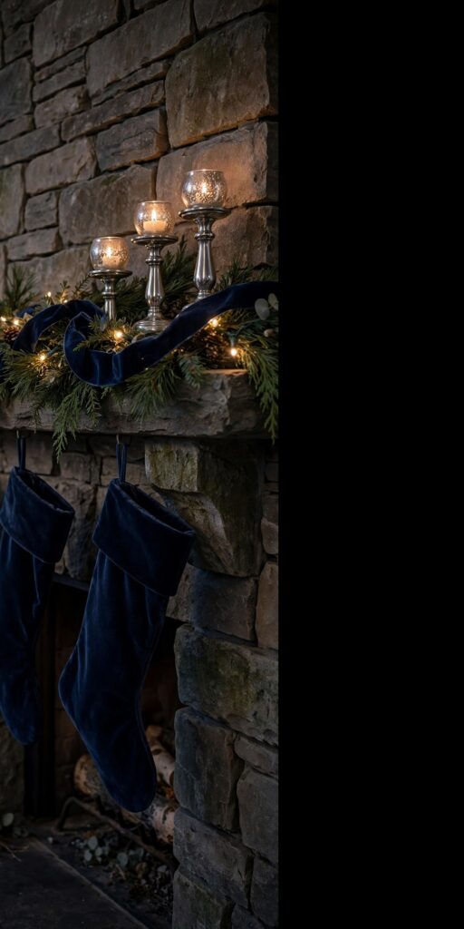
Tip: Hang one ornament cluster low at each end of the mantel rather than spreading pieces evenly. Clusters read as styling; an even sprinkle reads as storage.
7. Hang a Blue Wreath on the Door — and Copy It at the Windows
One wreath is a decoration; a matching set is a design decision. Dress the front-door wreath in the house palette — a navy velvet bow, silver or blue ornaments wired into the greenery — then make smaller, simpler copies for the inside of the front windows or over a hallway mirror. From the street, the repetition reads intentional and a little grand; from inside, the window wreaths frame the view like artwork.
Keep the copies simpler than the original: greenery, the bow, nothing else. Matching bows are the thread that links them, so buy the ribbon in one dye lot and make all the bows in one sitting, the same size, tied the same way. It is an afternoon of work that makes the whole front of the house look professionally dressed.

Tip: Hang window wreaths from the top of the frame with ribbon rather than hooks on the glass — the ribbon becomes part of the design and nothing scrapes or rattles.
8. Set the Table in Navy, White, and One Metallic
The blue Christmas table succeeds on discipline: a navy tablecloth or runner, white or cream dishes, and exactly one metallic carried through the flatware, candle holders, and napkin rings. White dishes are the quiet hero — they keep navy from swallowing the table and give the food something bright to sit on.
For the center, skip the floral arrangement and run a low line of blue glass ornaments and silver or gold votives down the middle, on or beside a bed of greenery. Guests can see over it, it costs almost nothing if the ornaments come off the tree’s stash, and the candlelight through blue glass is the prettiest light a dining room gets all year. Blue linen napkins, loosely rolled, finish each setting.

Tip: Mix the blue glass — a few deep navy pieces with paler ones — rather than matching perfectly. Candlelight evens out the differences and the mix reads collected, not packaged.
9. Wrap the Gifts in Blue Paper and White Ribbon
Here is the cheapest idea in the article and the one with the highest visual return. For the weeks before Christmas, the presents under the tree are the tree’s bottom layer of decoration — so wrap them in the palette. Solid navy paper with white or cream ribbon is the core combination; add one patterned blue-and-white paper as the accent for special gifts.
Two rolls of navy, one of white or patterned, and a spool of white ribbon will wrap a whole season on theme. Keep the wrapping plain and tailored — crisp corners, flat ribbon, no giant bows competing with the tree — and the pile reads as part of the room’s design instead of visual noise. This is also the fastest way for a renter or a red-and-green ornament owner to test the blue look for one year.

Tip: Wrap a few empty boxes the day the tree goes up. The display looks finished immediately, and real gifts join the arrangement as the month goes on.
10. Swap the Sofa’s Throws and Pillows for Blue Wool and Velvet
Textiles are how blue spreads through a room without a single new ornament. Swap the sofa’s everyday throw for a cream wool or knit one, add navy velvet pillow covers over the inserts you already own, and layer one dusty-blue cushion between them to bridge the two. The tree’s palette is suddenly sitting in the seating, and the room reads coordinated from the doorway.
Fabric choice matters more than color here. Wool, knit, and velvet keep blue feeling warm and touchable; shiny satin or thin polyester in the same navy can read cold and cheap. Pillow covers also store flat in January, which makes this the most renter-friendly, lowest-commitment idea on the list.
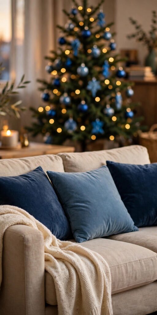
Tip: Keep one warm neutral in the mix — the cream throw is not optional. A sofa dressed in nothing but blue and gray is the waiting-room look this article exists to prevent.
11. Carry Blue into the Kitchen with Glassware and Linens
The kitchen is where most whole-home schemes quietly give up, which is why carrying blue there makes the house feel completely committed. You probably own the raw materials already: blue glassware, striped or chambray dish towels, blue-and-white dishes. Grouped deliberately — glasses on an open shelf, a folded stack of blue linens beside the sink, a bowl of blue ornaments on the counter — everyday objects become the decor.
Chambray and denim blues earn their keep here: they suit a working room, hide holiday-season wear, and need no metallic partner to look right. One small gesture ties the kitchen to the rest of the house — a sprig of greenery or a miniature wreath on a cabinet door, dressed with the same navy ribbon used on the tree.
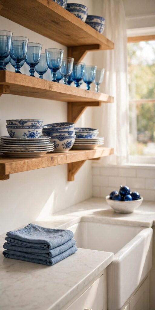
Tip: Blue glass looks best with light behind or inside it. A shelf near a window, or a small strand of warm fairy lights behind the glasses, turns ordinary glassware into the room’s glow.
12. Style a Blue Bedroom with Icy Accents and Cream Knits
A blue Christmas bedroom should feel like snowfall outside a cabin window: quiet, pale, and soft. Keep the base bedding cream or ivory, then layer the blue at the edges — an icy-blue throw folded across the foot of the bed, dusty-blue pillowcases or a single velvet cushion, and a small bowl of silver and pale-blue ornaments on the nightstand.
Resist importing the living room’s navy at full strength; bedrooms take the palest version of the palette better, and the lighter blues sit more peacefully with lamplight. One small wreath over the headboard or on the door, tied with the house ribbon, is usually all the “Christmas” the room needs beyond the textiles.

Tip: Swap, don’t add. Replacing the usual throw and pillow covers with the blue versions keeps the room serene; layering Christmas textiles on top of everyday ones just looks like laundry.
13. Light the Porch with Blue Velvet Bows on the Lanterns
The porch is the palette’s public face, and it takes surprisingly little: two lanterns flanking the door, each tied with a navy velvet bow, with warm-white light glowing inside. The bows echo the door wreath (idea 7), the warm light keeps the blue from going cold outdoors, and the pair frames the entry like the cover of a catalog.
If your porch has planters, fill them simply — white or cream containers with snowy branches, pinecones, and unlit blue ornaments nestled at the base. Keep outdoor pieces to things weather cannot ruin, and let the bows be the only fabric: velvet sheds water better than satin and holds its shape in the cold. Battery candles on timers mean the whole display lights itself at dusk.
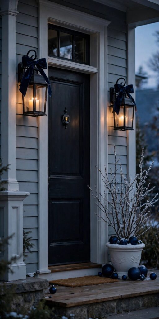
Tip: Match the porch bows to the wreath bow in size as well as color. Repetition at the same scale is what makes a front door look designed rather than assembled.
14. Add One Soft Blue-and-Blush Accent
Every strict palette benefits from one gentle exception. Powder blue with dusty blush — a blush throw on one chair, a few blush ornaments deep in the tree, blush ribbon on a single wreath — keeps a blue scheme from feeling like a showroom and gives it a romantic, personal note. The blush works because it is blue’s warm opposite at the same soft intensity.
The guardrail is proportion: blush stays an accent, roughly one piece in ten, and never becomes a second theme. Used this way it also future-proofs the decor — the same blue pieces can lean icy-silver one year and blush-soft the next, with only the accent pieces changing. If pink is your true love, give it its own year and its own scheme rather than splitting this one.

Tip: Place the blush pieces where people sit and linger — the reading chair, the tree’s front lower branches — not at the edges of the room. The warmth should be discovered up close.
15. Build a Blue Entryway Moment Around the Console Table
The entryway is the first and last thing guests see, and it takes the palette in miniature: a console or small table styled with a blue runner, a cluster of blue-and-white pieces (a ginger jar if you have one, or blue glass ornaments gathered in a bowl), and a small wreath hung on the mirror or wall above it. Everything here is a scaled-down echo of the living room, which is exactly why it works.
Keep the surface mostly clear — this is a working landing strip for keys, mail, and mittens, not a display shelf. One styled cluster on one side, open space on the other, is the arrangement that survives real December life. A navy runner underneath protects the wood and quietly holds the whole vignette in the palette.
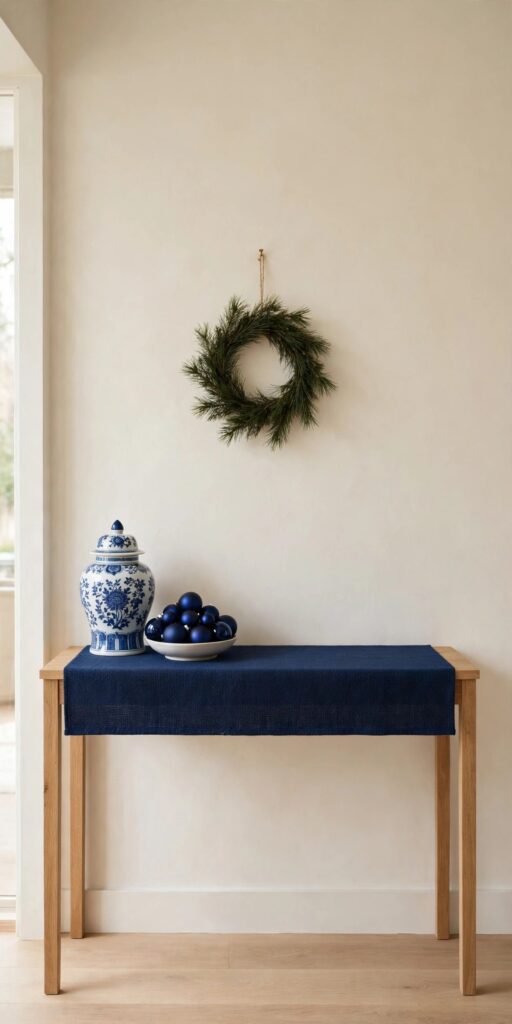
Tip: Repeat one exact object from the living room here — the same ornament style, the same ribbon — rather than a similar one. Exact repeats stitch two rooms together; near-misses just look accidental.
Frequently Asked Questions
What colors go with blue Christmas decor?
The reliable partners are cream and ivory (warmth), white (brightness), silver (frost), gold or brass (warmth and formality), copper (soft modern warmth), and natural wood and wool textures. The system that works: one lead blue, one metallic, one warm neutral or texture, repeated everywhere. Avoid adding a second strong color family — red, for instance — unless you are deliberately switching to a red-white-and-blue scheme.
How do I keep blue Christmas decor from looking cold?
Three things do the work: warm-white lights (never blue-tinted or cool-white bulbs), cream instead of stark white as the neutral, and warm textures — wool, knit, velvet, wood — within reach of every blue surface. If a room still feels chilly, the light temperature is almost always the culprit, and it is the cheapest fix on the list.
Which blue is best for a Christmas tree?
Navy is the most forgiving on a green tree: it is deep enough to read clearly against the branches and pairs with both silver and gold. Icy pale blue is beautiful but needs help — hang pale ornaments toward the lit, outer branches so they do not wash out. Whatever blue you choose, layer it in three tones (deep, mid, icy) and mix matte, gloss, and velvet finishes for depth.
Can I mix silver and gold ornaments in a blue scheme?
It is better not to on the same tree or mantel. Silver reads icy and gold reads warm, and together they argue. Choose the metallic that suits the room — silver for bright, frosty schemes; gold for evening-cozy ones; copper as the middle path — and carry that one choice through the whole house for a pulled-together look.
How can I try blue Christmas decor on a budget?
Start with the ideas that use what you own: blue wrapping paper under the tree (idea 9), pillow covers and a throw swap (idea 10), and blue glassware and linens grouped in the kitchen (idea 11). Add ornaments one shade at a time — a box of navy matte and a box of navy gloss — rather than a mixed set, and let cream textiles you already own supply the warmth.
Final Thoughts
Blue Christmas decor is not really about blue things. It is about three calm decisions — a lead blue, a metallic, a warm texture — repeated with enough discipline that every room feels like part of the same winter evening. Start with the tree and the wrapping paper if the budget is tight, or with the velvet mantel and chinoiserie if this is your splurge year. Either way, light it warm, ground it with cream, and the blue will do the rest.